Movement Maps
A new way to visualize the way you move.
We’re excited to announce the release of Movement Maps — a tool to look at walking and running in great visual detail.
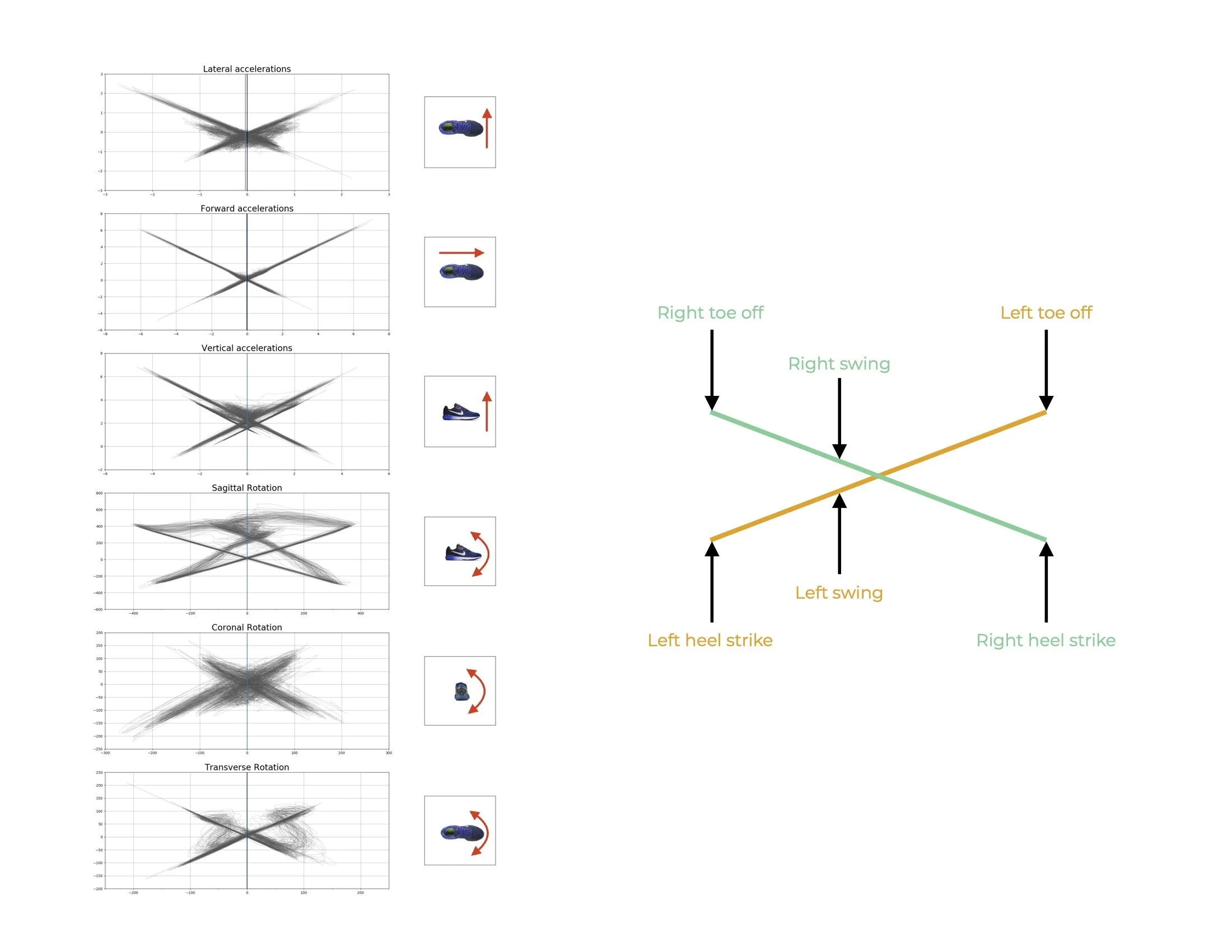
Movement maps show the movement of both feet along each of the six axes measured by our sensors, over the course of a step. They are unique to each person and represent a qualitative measure of movement dynamics.
All six axes captured by our sensor.
A step is shown as one circuit through the movement map phase space diagram, and each additional step is plotted on top of the previous step. You can see how the movement map is created by the movement of both the left and right feet in the video below.
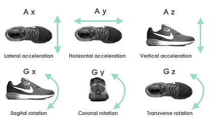
For each activity, there is a set of six maps, each of which represents one direction of acceleration or rotation.
With these maps, you can see both the left-to-right limb asymmetry and the the step-to-step variability of each limb. Symmetrical movements will look like a mirror image on both sides of the centre line, while for asymmetrical movements, one side of the plot will be smaller and one side will be larger. In movements with low variability, the plot will appear as a solid line as the same step circuit is repeated multiple times. In movements with high variability, the plot will appear fuzzy, as the circuit changes with each step.
How to use movement maps
By looking at all six maps for one activity, you can visualize the asymmetry and variability in the different planes of movement, for the different phases of gait.
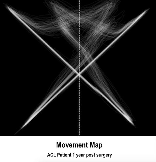
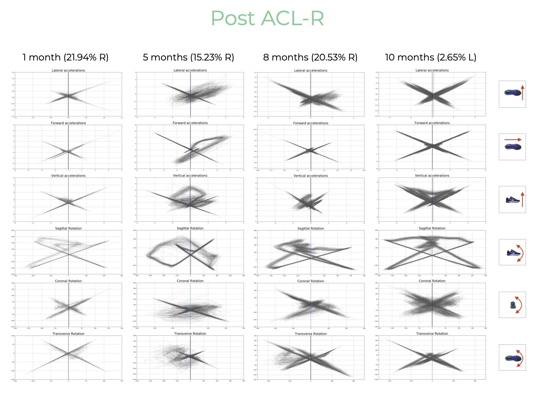
The image below shows the movement maps generated over ten months for a patient recovering from left ACL reconstruction surgery. The first map shows high asymmetry, but very low variability as the person walks slowly and carefully. At 5 months, there is significant asymmetry, and the left side also shows higher variability as they are re-learning how to walk and testing their limits. At 8 months, it’s getting better, and at 10 months, there is pretty close asymmetry and a normal amount of variability on both sides. By monitoring movement maps for the same person over time, you can see trends in their movement signature and determine the deficits that need to be addressed as they progress.
How to see movement maps
Movement maps are most valuable for walks and runs of between 1 and 2 minutes. To compare maps between different activities, consistency is important: the walk or run should be performed at the same speed, for the same amount of time, and on the same surface.
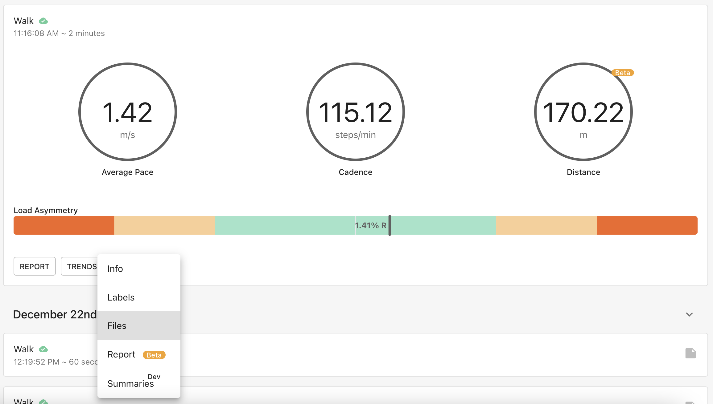
To find Movements Maps, click on the drop down next to “Explore”, and go to “Files”. Then click “Generate Movement Map.”
Once the map has been generated, click the link to view it.